Archives For landscape

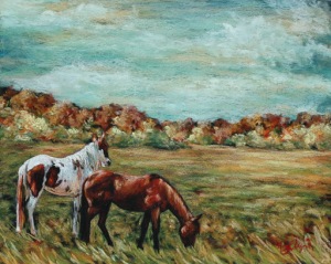
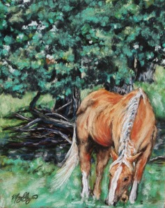
Pair of Horses

marylizingramart —  July 27, 2011 — Leave a comment

Pair of Horses
16×20 soft pastel on Pastelbord, $350 framed

My newest piece…

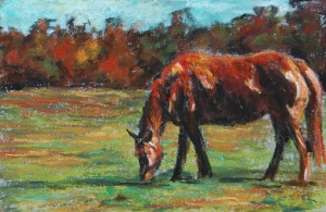
I’ve been wanting to draw horses lately. Drawing a horse’s body, with it’s distinct muscles, long legs and neck, is very different from drawing a cow or a sheep, with their stocky, thick bodies. The light glows off of the horses sleek curves; the gracefulness of the animal invites me to pause and reminisce, to think of the wonder in our world, the beauty in the family of things, of which we are a part. I think of the freedom of childhood, the rush of life. Through the beauty and being of a horse, I feel an echo of emotions, a connection to something unspoken.

9×12 Soft Pastel on Pastelbord, Commissioned

For this piece, I combined several elements from previous pictures to suit my clients wishes…the swirling turquoise sky, the rust colored trees, the gray barn, and a Southern field full of cotton.

Colourfix Suede

marylizingramart —  May 6, 2011 — 1 Comment

Recently my friends at Forstall Art Supply gave me a sample of the very new pastel paper Colourfix Suede to try out. At first touch, it feels like a smooth suede, as the name suggests, very different from the rough sanded textures I usually choose. 

My first experience with the paper showed me that certain pastels and techniques work better than others. Using very soft Sennelier pastels, I found that the softer, creamier pastels adhere better than harder pastels; a lighter touch yields better results than my usual heavy-handed layering.

4 1/2 x 7 soft pastel on Colourfix Suede

While it did hold layers well, more blending occurred than on sanded papers, maybe less blending than basic pastel papers (paper sans coatings). 

I had trouble getting my beloved Sennelier black pastel to adhere.

Unsatisfied with my first attempt, I did a bit of research and found that Colourfix Suede is great for the delicate Pan Pastels and fans of pastel application via soft tools and fingers (toothier surfaces can irritate fingers and damage applicators). Pastel pencils are also supposed to work well on the fine surface. Because the suede surface is applied to a watercolor paper, an underpainting (using paint to create a colored base for the pastel piece) is said to work well on this paper. 

With this new information, I tried a second piece, using several techniques and types of pastels.

4×4 Soft Pastel on Colourfix Suede

For the sky I applied the pastel with my fingers, rubbing the Sennelier pastel color onto the paper. This is as close as I could get to a Pan Pastel application. Again, the creamier pastels transferred more color. I used pastel pencils and Rembrandt pastels for the landscape. The pencils went on the paper well, and I was very surprised at how much color adhered with the Rembrandts, which are a harder pastel and usually not my favorite. The black went on darkly like I wanted, even over layers of pastel. On this paper, I would definitely reach for my Rembrandts!

As usual, I will say that all surfaces, pastels and combinations of the two yield different results. If you want a paper that will hold layers and result in a creamy, smooth painting, this paper is for you! If I use this paper in the future, I will draw with Rembrandt pastels and save my Senneliers for my sanded papers and boards.

Colourfix Suede is available in 6 colors, and black and white.

Sometimes you find new inspiration in unexpected places. Bored with the same old style of my art, last Fall I found bold new colors and the freedom to enhance what is seen thanks to a text message joke from my sister. As children, we had this joke (which will probably sound lame, but we thought it a hilarious trick). We took lots of road trips back then and whenever we saw a hay bale, we’d say “Hay, (insert name).” If the chosen trick-victim said “what?” the trickster would giggle and giggle and point at the hay bale, exclaiming “I got you!” I told you…a little lame, an inside joke, but it was funny to us. As adults, let’s just say it may or may not still happen…

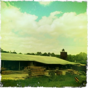
Now bringing my ramblings to a point: on the way back from a family beach trip, my sister texted me the picture below with “Hay (omitting funny childhood nickname) Mary Liz!” She had snapped the photo out of the window with the Hipstamatic App on her iPhone.

Hay Bales, 12×16 soft pastel

Her little joke set me on a new course full of turquoise and golden skies, darkening edges, simple photos from our region of the world. Since that day, I have taken a whole collection of pictures from rural Alabama and love finding inspiration in alternative colors thanks to Hipstamatic. If you are unfamiliar with this camera app, it is a program you can purchase very inexpensively on smart phones that allows you to change combinations of lens and film to get different colors and effects. My favorites are the John S lens and the Bettie XL lens. I love experimenting with it…you never know when you’ll get something new and fabulous! It is a great asset to my artwork. Below is another example of a different lens/film combination.

“Resurrection. The reversal of what was thought to be absolute. The turning of midnight into dawn, hatred into love, dying into living anew.
If we look more closely into life, we will find that resurrection is more than hope, it is our experience. The return to life from death is something we understand at our innermost depths, something we feel on the surface of our tender skin. We have come back to life, not only when we start to shake off a shroud of sorrow that has bound us, but when we begin to believe in all that is still, endlessly possible.
We give thanks for all those times we have arisen from the depths or simply taken a tiny step toward something new. May we be empowered by extraordinary second chances. And as we enter the world anew, let us turn the tides of despair into endless waves of hope.”

-Molly Fumia

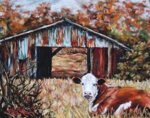
Rust, 8×10 soft pastel on card

In preparation for upcoming art shows, I am adding to my “Southern Exposure” pastel series with some new pictures from the rural south. Even though I live in “the city,” rural Alabama is very much a part of my life, from road trips and extended family, to our produce bought through the Eastlake Farmer’s Market and our dairy picked up from Wright Dairy in Alexandria. I love the beauty of our rural landscape, the thick trees, the rolling fields, the lazy cows, and the old barns in so many conditions, shapes and colors.

Wood, 4×6 soft pastel on card

Sometimes art comes out almost effortlessly. You can sit down, full of energy, and pop out a piece of art quickly and without struggle. Last week felt that way to me. I was able to create several pieces in an afternoon, a quick piece at the kitchen table in the morning, another while my kids played in the yard.

Then the pollen came. For years I have made it through the Spring without any allergic downfalls…but this year, I have not escaped! My energy curbed by a heavy head, cue “the hard days”: those times when art is a wrestling match, a struggle to create, when nothing comes easy.

A few years ago (well, probably more years ago than I care to admit), a man told me during a one-time conversation, in criticism of a statement I had made about waiting for the “right mood” to do art, that the mark of a “real” artist is if he or she creates art in any mood, even on bad days, similar to an athlete who pushes through the sport even when it is a fight. I remember being insulted, and thinking he was rather rude and pompous, but, as much as I hate to admit it, there is some truth in it. I reject his choice of words, because anyone who creates art is a “real” artist, whether they paint all the time or only when the mood strikes them. I also find it hard to compare an artist’s process to basketball practice. BUT… I can get behind the idea that a “professional” artist, or someone trying to make a living out of art must learn to create art in any mood.

So, here are my two pieces wrestled out on one of my hard days. I had high hopes for the pieces when I formed them in my mind, but the execution was a struggle. I still have distaste for some aspects, but another “must” for an artist is knowing when to walk away.

Little flock, 8×10 Soft Pastel on card

Shade Tree, 8×10 Soft Pastel on card

“Art is never finished, only abandoned.” -Leonardo da Vinci

Ocean Cliffs

marylizingramart —  March 18, 2011 — Leave a comment


Ocean Cliffs, 14×18 Soft Pastel on Card

The works of Monet and my love for the beauty of the British Isles inspired this piece; what made it’s creation even better was drawing outside on such a fabulous and warm Spring day. I love Impressionism, and this particular image seemed a perfect choice for another attempt at using bolder color and strokes. In my art room above my desk, I have a handwritten quote taped to the wall by Georges Riviere from 1877: “To treat a subject for the colors and not for the subject itself, that is what distinguishes the Impressionist from other painters.” I am far from an Impressionist and am constantly pulled toward capturing minute details, but this sentence echoes through my thoughts when I am drawing, pushing me to look for color over subject, for feel over accuracy. It never fails to surprise me that when I let go of rigidity and move with the colors, I step back and see that the picture has come together…and each time I delightfully wonder how it happened.

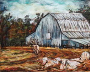
Gray Barn

marylizingramart —  March 18, 2011 — Leave a comment


Gray Barn, 8×10 Soft Pastel on Card

I was drawn to this scene by the curved, rutted tracks in front of the tall gray barn. I loved the colors in the grass and dirt, and put in some simply drawn cows to keep the piece company.

Hay Fields

marylizingramart —  March 18, 2011 — 1 Comment


Hay Fields, 12×16 Soft Pastel on Board

I love pastels, and I love teaching. Because of the nature of this dusty medium, it is hard to demonstrate to a large crowd since I cannot easily draw the picture upright, as on an easel, as the pastel dust cascades down the board with each stroke. To remedy this problem, in a recent pastel demonstration for the Birmingham Art Association, I inclined the board a bit to make it more visible and drew upside down, standing behind the table. My unorthodox method worked and here is the finished result: a colorful landscape that began upside down and was touched up a bit at home. I like the bright colors and think it is a pleasant, simple little scene.