


I’m teaching a class to a group of beginning pastelists: Some students have read up on pastel techniques, others may have had a few classes. My first instruction always throws them for a loop: “Begin with lots of black!”
As I’ve said before, I’m a self-taught artist…When it comes to pastels, I fiddled with them alone at my art desk until I discovered results I liked. And it all started with black.
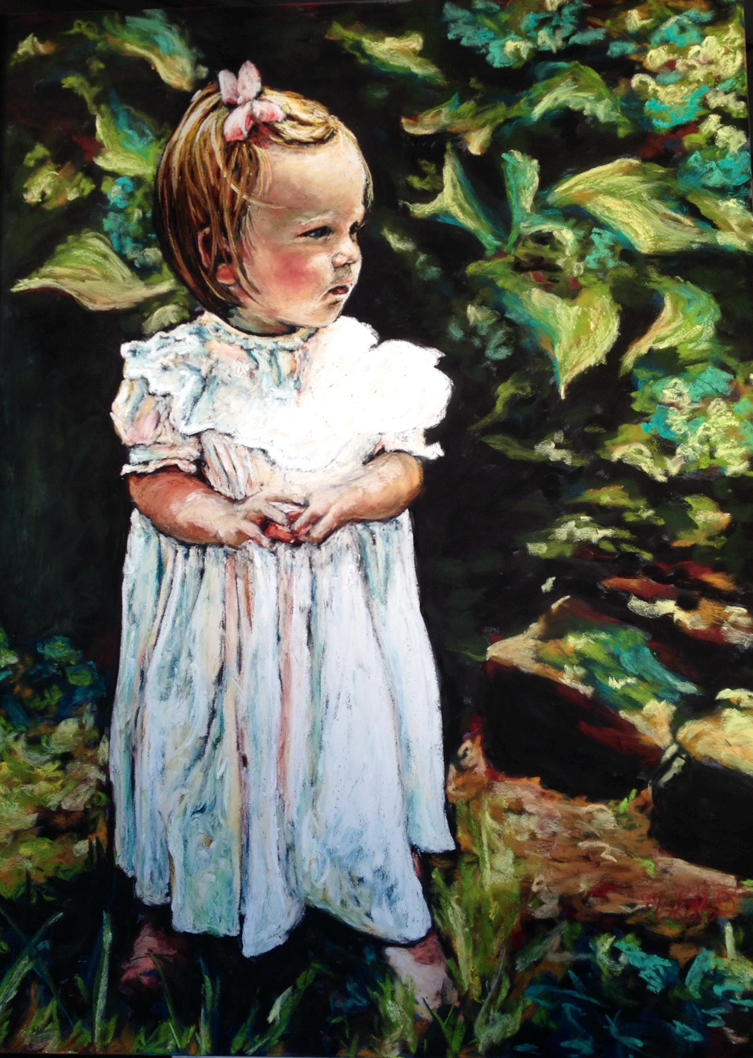
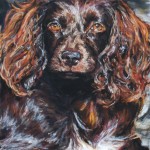
Below you will find a quick tutorial using my own technique to create vibrant, textured pastel paintings. I use a variety of papers, and very soft pastels. For this pet portrait, I used Sennelier La Carte pastel card in sienna, and very soft Sennelier pastels. I sometimes use a different brand of black for my base layer, but they are never as dark as Sennelier.
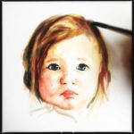
I begin by sketching out the subject in black. I fill in all areas where shadows will be, scrubbing in darker areas with heavier pastel. If my subject has some very white areas, I usually add in the white to “save” that area (sometimes I get too excited with my pastels, and I will zoom right over areas that are supposed to be white!) If you are using pastel paper, use a lighter hand with the black (pastel does not have as much to “grip” with paper, and tends to smear and blend).

Boykin Spaniel 1st layer
After my base layer of black is in place, I begin using bright colors for my middle layer. These are chosen based on the undertones I see in different areas of my subject, such as the dog’s fur. Choosing underlying colors is sometimes difficult for beginners, but it will come with practice. A helpful tip I offer to students is to hold the pastel in question (say, orange or fuchsia) next to your photograph and see if the color clashes (then nix it), or seems to “go” (then use it!). Again, if you are not using a textured paper, don’t apply the bright colors as heavily.

Boykin Spaniel 2nd layer, 8×10 Soft Pastel on Card, private commission
After I’ve completed the “psychedelic” stage, it’s time to apply the more neutral tones as the top layer, bringing all the layers together. While papers cause the pastels to blend more, a nice textured surface will keep the colors more distinct and let them all show through to create a unique end result. I make sure to let the blacks peek through in places…my shadows are already in place!

Boykin Spaniel, 8×10 Soft Pastel on Card, private commission
After the top layer of neutrals, I come back in and darken the shadows and highlight as needed. Generally, I do the background first, but for some reason I did not in this portrait. I finish my piece by tapping off the excess dust (never blow it! I’ve made that mistake before…messy, messy, and you can inhale it…never good) and I give it 2 light sprays of fixative (leaving 2 minutes in between sprays).
I would love to hear from you…what pastel techniques do you favor?