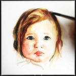
Portraits don’t always have to be large! This trio of portraits were done in pastel on 4×4 inch peices of Sennelier La Carte Pastel paper. It’s a different sort of challenge, working small with chunky pieces of pastel, but it is a challenge I enjoy!

Portraits don’t always have to be large! This trio of portraits were done in pastel on 4×4 inch peices of Sennelier La Carte Pastel paper. It’s a different sort of challenge, working small with chunky pieces of pastel, but it is a challenge I enjoy!


Pair of Horses
16×20 soft pastel on Pastelbord, $350 framed
My newest piece…
I’ve been wanting to draw horses lately. Drawing a horse’s body, with it’s distinct muscles, long legs and neck, is very different from drawing a cow or a sheep, with their stocky, thick bodies. The light glows off of the horses sleek curves; the gracefulness of the animal invites me to pause and reminisce, to think of the wonder in our world, the beauty in the family of things, of which we are a part. I think of the freedom of childhood, the rush of life. Through the beauty and being of a horse, I feel an echo of emotions, a connection to something unspoken.
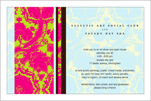
This Saturday July 30 from 4:30-8:00 the Eclectic Art Social Club will hold it’s first art show, exhibiting a variety of unique art for sale by 7 Birmingham area artists! The show will be at Escape Day Spa in Crestline Village in Mountain Brook and will feature:
acrylic abstracts by Cecily Hill Lowe

oil paintings on metal by Erin Hardin

collage and jewelry by Dariana Dervis

unique mixed media paintings and other creative pieces by Sunny Carvalho

ceramics and paintings by Chi Roach,
jewelry by Marjorie Gilkey,
and pastel paintings by me, Mary Liz Ingram

There will definitely be art for every taste! We will have refreshments, door prizes, and spa giveaways! Spread the word and bring your friends!

10×10 Soft Pastel on La Carte Pastel Card
Down some beautiful winding country roads outside of Columbus Georgia, and down a narrow road through a canopy of trees, we came to a sunlit clearing wide with spring green grass, surrounded by a just distant circle of thick trees and a vivid blue sky. Perched atop the grassy hill shone a gleaming white old chapel, relocated to the spot by the landowner. This dreamlike, private location was the setting of a perfect small wedding a few months ago…simple, elegant and gloriously bright. An artist’s dream come true!

Artists are always looking for new ways to share their art, and to merge the message of their art with the right location. Recently, I have taken some of my art to Escape Day Spa, a peaceful new spa located in a quiet house-turned-buisiness just off the main street in Crestline Village, Mountain Brook, Alabama. I like to convey a sense of peace and stillness in many of my pieces, so such a relaxing location seems a perfect fit. Below are a few of the paintings currently displayed (and for sale!) at the spa.


Waterlilies, 4×4 and 5×7 Soft Pastels

Joy, 8×10 Soft Pastel

Ocean Cliffs, 14×18 Soft Pastel

The Empty Tub, 18×24 Soft Pastel

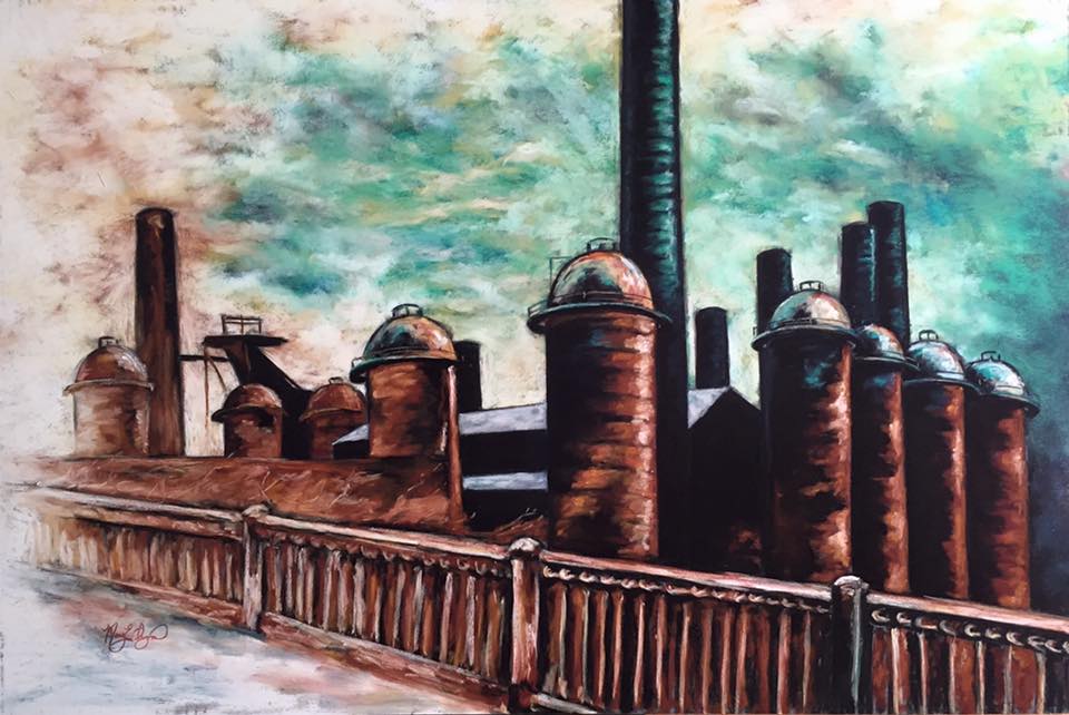
9×12 Soft Pastel on Pastelbord, Commissioned
For this piece, I combined several elements from previous pictures to suit my clients wishes…the swirling turquoise sky, the rust colored trees, the gray barn, and a Southern field full of cotton.
Smooth, sandy, rough, scratchy, thick, thin…and stippled! As I’ve said many times before, there is a plethora of pastel surfaces and textures upon which great art can be made. The newest paper sample I’ve tried is from Bee Paper Company and is called “Stipple Paper,” thanks to my friends at Forstall Art Center. The paper feels smooth and slick to the touch, with a finely pebbled surface. I decided to try a small portrait with several types of pastels to get a good feel for this new texture.
Here is my result:

5×51/2 Soft Pastel on Stipple Paper
I used five types of pastels: my usual favorite, the very soft Sennelier Pastels; the slightly harder soft pastels by Rembrandt; a variety of soft pastel pencils; a black Conte pastel; and an inexpensive set of square soft pastels.
To compare the application, on the image below I used all five: starting from the top left, the black is the square pastel, then the Sennelier in the top center, bottom right is Rembrandt, bottom left is the Conte. I sketched out the mage in a brown pastel pencil. All pastels adhered well with minimal excess dust.

I rubbed some blues in with my finger to begin the sidewalk, and filled in the black.

I finished up the piece by using Sennelier to finish the background, pastel pencils and Rembrandts for the face, Rembrandts with Sennelier highlights for the hair, and Sennelier for the shirt and clover. I was pleased with the result of the Stipple Paper and appreciate that all the types of pastel worked so well. I also enjoyed the sleek yet pebbled texture, and prefer it over the spotty texture you get from a traditional piece of pastel paper, such as Canson or Mi Tientes. From a sillier place in my mind, I like the paper because of its name…”Stipple Paper”…its just fun to say!
About a week ago, on that unusually cold Southern Spring weekend, I participated in the first Village Art Festival at Brookwood Mall in Birmingham, Alabama. Wonderfully organized by the Birmingham Art Association and the mall, for me the show was a success. My booth was full of art and placed outside, across from restaurants and a flowing fountain.

As “supervisor” of the Kids Zone, I have to brag on the organizers whose creativity and forethought set up the best and smoothest kid’s art area I have ever seen. The families who participated had a blast, and were very excited to take home their own art supplies!

My large pastel “Shepherd’s Hut” finally found a home, and I made lots of great connections to other artists and art lovers.

I also acquired a sample of pastel cloth to experiment with, courtesy of a new friend whose art will be highlighted in a post to come!
A second show is being planned for next year…I recommend participation to artists and the public!

Recently my friends at Forstall Art Supply gave me a sample of the very new pastel paper Colourfix Suede to try out. At first touch, it feels like a smooth suede, as the name suggests, very different from the rough sanded textures I usually choose.
My first experience with the paper showed me that certain pastels and techniques work better than others. Using very soft Sennelier pastels, I found that the softer, creamier pastels adhere better than harder pastels; a lighter touch yields better results than my usual heavy-handed layering.

4 1/2 x 7 soft pastel on Colourfix Suede
While it did hold layers well, more blending occurred than on sanded papers, maybe less blending than basic pastel papers (paper sans coatings).

I had trouble getting my beloved Sennelier black pastel to adhere.

Unsatisfied with my first attempt, I did a bit of research and found that Colourfix Suede is great for the delicate Pan Pastels and fans of pastel application via soft tools and fingers (toothier surfaces can irritate fingers and damage applicators). Pastel pencils are also supposed to work well on the fine surface. Because the suede surface is applied to a watercolor paper, an underpainting (using paint to create a colored base for the pastel piece) is said to work well on this paper.
With this new information, I tried a second piece, using several techniques and types of pastels.

4×4 Soft Pastel on Colourfix Suede
For the sky I applied the pastel with my fingers, rubbing the Sennelier pastel color onto the paper. This is as close as I could get to a Pan Pastel application. Again, the creamier pastels transferred more color. I used pastel pencils and Rembrandt pastels for the landscape. The pencils went on the paper well, and I was very surprised at how much color adhered with the Rembrandts, which are a harder pastel and usually not my favorite. The black went on darkly like I wanted, even over layers of pastel. On this paper, I would definitely reach for my Rembrandts!
As usual, I will say that all surfaces, pastels and combinations of the two yield different results. If you want a paper that will hold layers and result in a creamy, smooth painting, this paper is for you! If I use this paper in the future, I will draw with Rembrandt pastels and save my Senneliers for my sanded papers and boards.
Colourfix Suede is available in 6 colors, and black and white.
Sometimes you find new inspiration in unexpected places. Bored with the same old style of my art, last Fall I found bold new colors and the freedom to enhance what is seen thanks to a text message joke from my sister. As children, we had this joke (which will probably sound lame, but we thought it a hilarious trick). We took lots of road trips back then and whenever we saw a hay bale, we’d say “Hay, (insert name).” If the chosen trick-victim said “what?” the trickster would giggle and giggle and point at the hay bale, exclaiming “I got you!” I told you…a little lame, an inside joke, but it was funny to us. As adults, let’s just say it may or may not still happen…
Now bringing my ramblings to a point: on the way back from a family beach trip, my sister texted me the picture below with “Hay (omitting funny childhood nickname) Mary Liz!” She had snapped the photo out of the window with the Hipstamatic App on her iPhone.


Hay Bales, 12×16 soft pastel
Her little joke set me on a new course full of turquoise and golden skies, darkening edges, simple photos from our region of the world. Since that day, I have taken a whole collection of pictures from rural Alabama and love finding inspiration in alternative colors thanks to Hipstamatic. If you are unfamiliar with this camera app, it is a program you can purchase very inexpensively on smart phones that allows you to change combinations of lens and film to get different colors and effects. My favorites are the John S lens and the Bettie XL lens. I love experimenting with it…you never know when you’ll get something new and fabulous! It is a great asset to my artwork. Below is another example of a different lens/film combination.

I'm a self-taught pastel & watercolor artist and instructor, raised and based in Birmingham, Alabama. I constantly collect stories and pieces of the world around me, turning them into works of art. Inspired by nature, I love to share what I've learned and build connections and community. I invite you to browse and join my site. I hope you find something that inspires you!

Voted one of Birmingham's Best Local Artists 2013, Birmingham News & al.com
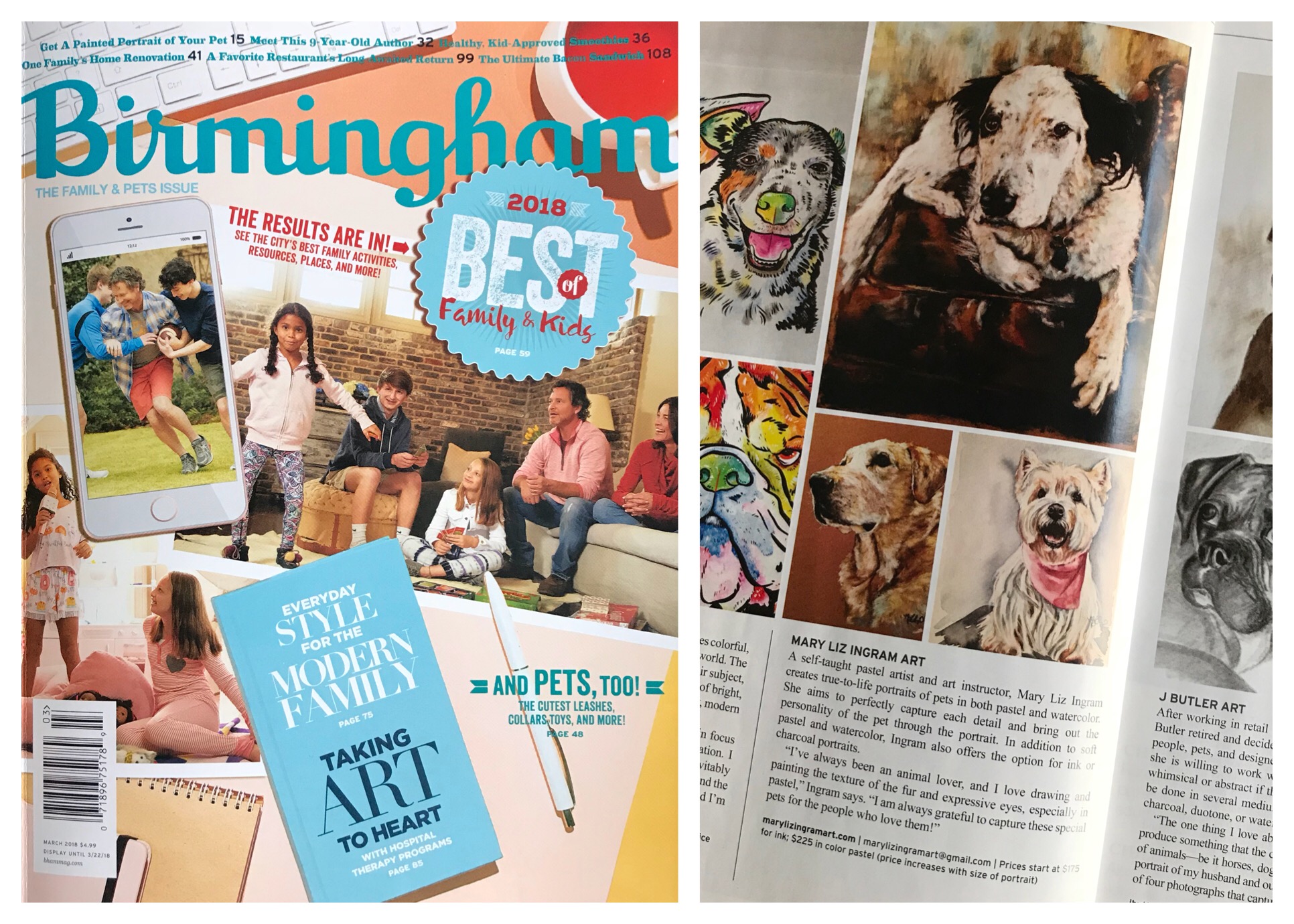
Featured in Birmingham Magazine, March 2018
Visit the Commissions page on the top menu to find out more about my pastel & watercolor portraits. Portraits are drawn from photographs in a timely manner with the highest quality materials to ensure they will be enjoyed for generations!

Thanks for visiting my site! I am an awarded pastel artist and instructor based in Birmingham, Alabama. A self-taught artist, I have been working with pastels for over 6 years, selling in shops, galleries, shows and by commission. I teach pastel workshops for adults, and love to help emerging artists on their journey into the art community.