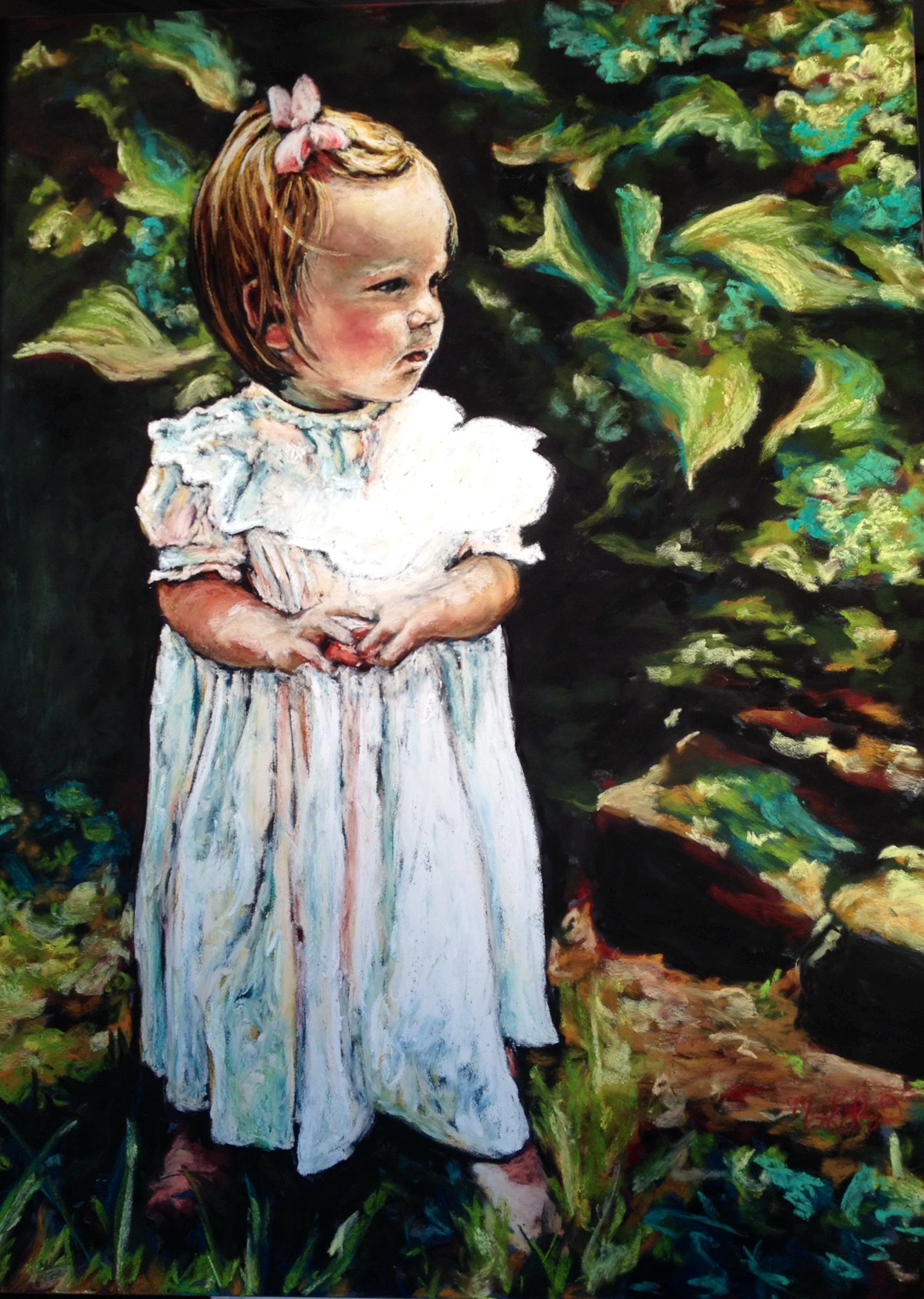
Smooth, sandy, rough, scratchy, thick, thin…and stippled! As I’ve said many times before, there is a plethora of pastel surfaces and textures upon which great art can be made. The newest paper sample I’ve tried is from Bee Paper Company and is called “Stipple Paper,” thanks to my friends at Forstall Art Center. The paper feels smooth and slick to the touch, with a finely pebbled surface. I decided to try a small portrait with several types of pastels to get a good feel for this new texture.
Here is my result:
5×51/2 Soft Pastel on Stipple Paper
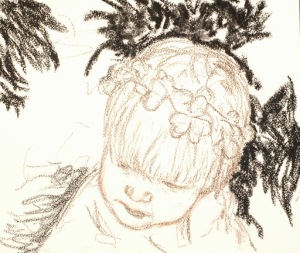
I used five types of pastels: my usual favorite, the very soft Sennelier Pastels; the slightly harder soft pastels by Rembrandt; a variety of soft pastel pencils; a black Conte pastel; and an inexpensive set of square soft pastels.
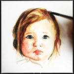
To compare the application, on the image below I used all five: starting from the top left, the black is the square pastel, then the Sennelier in the top center, bottom right is Rembrandt, bottom left is the Conte. I sketched out the mage in a brown pastel pencil. All pastels adhered well with minimal excess dust.
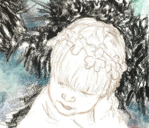
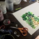
I rubbed some blues in with my finger to begin the sidewalk, and filled in the black.
I finished up the piece by using Sennelier to finish the background, pastel pencils and Rembrandts for the face, Rembrandts with Sennelier highlights for the hair, and Sennelier for the shirt and clover. I was pleased with the result of the Stipple Paper and appreciate that all the types of pastel worked so well. I also enjoyed the sleek yet pebbled texture, and prefer it over the spotty texture you get from a traditional piece of pastel paper, such as Canson or Mi Tientes. From a sillier place in my mind, I like the paper because of its name…”Stipple Paper”…its just fun to say!


