Archives For Paper

Doing a back flip

Mary Liz Ingram —  January 10, 2013 — Leave a comment

I go on and on about the glories of textured pastel paper-which I love and prefer-but sometimes, I do use a piece of “regular” pastel paper…with a twist. While I mostly use Ampersand Pastelbords and Sennelier La Carte pastel card, I often choose a sheet of pastel paper for soft subjects, like a baby’s face. However, I do NOT like the little dots that show up on most papers.

So, I just flip it over and use the back! Continue Reading…

Back in the Game

marylizingramart —  July 8, 2012 — 2 Comments

“Tree of Life,” Ink sketch All wrapped up close together in our little house, we’ve added a fifth person to our family. My sweet baby is just now old enough for me to steal some time away, to turn my thoughts, for at least a few moments, inward to the world of art. When I look inside and peruse my creative thoughts, I see a very different world. With so much time passed between my last stream of art and today, my life has changed. The birth of a child, the growth of a life, the changing tides of my life to a brighter, stronger place…what images stir within me, waiting to be formed with pen, pastel, paint and paper? It’s time for a renewal, to reinvent once again. I find an eager peace in the cycle of my art, that over the past few years I have come to recognize-high times and low times, ever-changing, twisting and turning to the creation of something new. I’m starting slow, with my small bits of time. Searching for what lies within, to see what will surprise me when I use my hands and let my broken, unplanned thoughts take shape. Thanks to a friend and art colleague’s recent art, Sunny Carvalho‘s morning drawings, I’m beginning my renewed journey with “Morning Sketches.” Each morning for two weeks I plan to draw whatever comes to the forefront of my mind-no concrete plans, no restrictions-just to see where it leads me. And if this endeavor does not lead me to a new starting place, it still leads me to further exploration of this new, complex and wonderful phase of my life.

At an art show last spring I met a fellow pastel artist and, after some discussions about techniques, we did a paper swap. I gave him a piece of Sennelier La Carte pastel card, and he generously gave me a large sample of a pastel cloth. I like to call this one “paper from the past,” because a) he bought it a very long time ago and can’t remember the brand, b) after research, it is very hard to find information about pastel cloth, and c) it doesn’t seem to be made much anymore, if at all.

I discovered two possible sources for pastel cloth, which comes in a roll and is a synthetic, unwoven fabric, with a coating similar to sanded papers, that will hold layers of pastel. NY Central Art Supply and Sennelier both make/have made a pastel cloth.

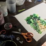
The cloth can be cut to the desired size, but needs to be mounted or secured in some way to keep it from curling. It can also be stretched like a canvas. Since I was experimenting, I just taped all four sides down with masking tape.

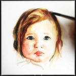
I cut several pieces and taped them down to a board and decided to try a few things. First I layered some pastels, browns, oranges and ochres, and painted with a brush and water. Then I added details of a lily in my yard. The result pleased me well enough: the paper held the layers well, the water did not affect the paper adversely, all brands of pastels that I tried worked fine (Sennelier, Rembrandt, Gallery, Derwent pastel pencils). 

5×7 Soft Pastel on Pastel Cloth

For the second “test” I tried a simple picture with my usual techniques. Again, the results were satisfactory, but I felt that the texture wasn’t as deep as I usually get by layering on Ampersand Pastelbord or Sennelier La Carte pastel card; the colors blended just a bit more.  

While I enjoyed trying and learning about a different surface, the benefits of pastel cloth, mainly the texture, are overshadowed, in my opinion, by the downside of it being a cloth. My “verdict” is biased because of my preference for a hard board or card on which to work, and it seems like an unnecessary step to mount the pastel cloth on a hard surface when I could just buy another surface with a similar texture that is already sturdy.

With pastel cloth being hard to find, and made somewhat irrelevant by the numerous types of sanded papers that can also be used with wet or dry mediums (such as Wallis Paper), it may be more convenient and less frustrating to try another surface.

But to those who already have pastel cloth, or like the ability to stretch or mount it onto the size and surface you want, you can create some beautiful pieces of art!

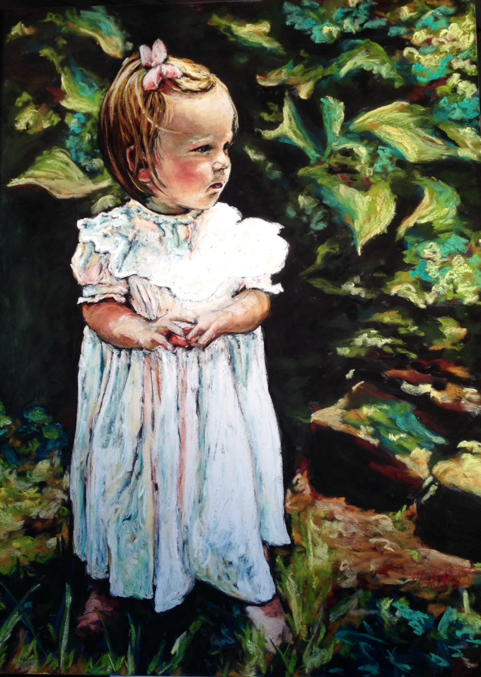
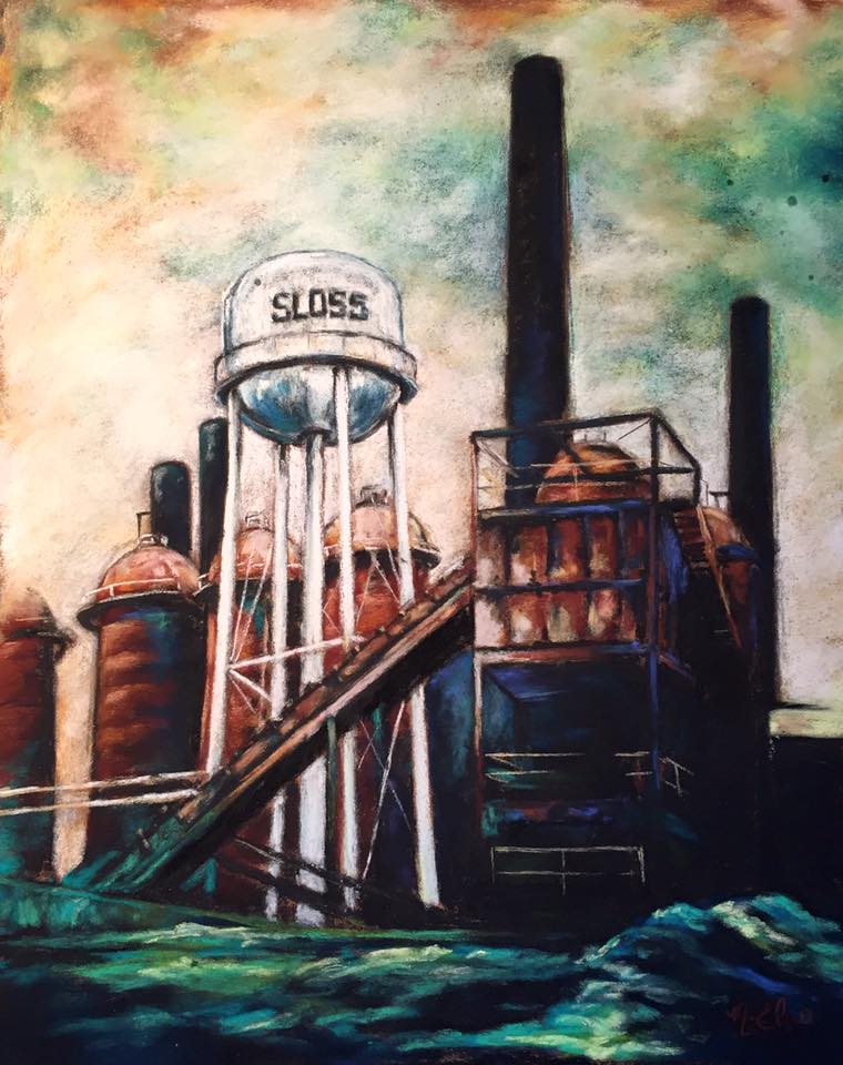
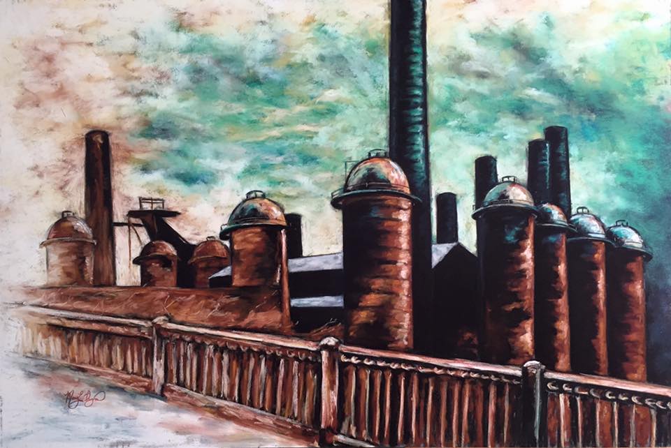
Check out the art by my friend Daniel Curry, who has done several pieces on pastel cloth and so kindly shared some with me!

View his work at www.dcurrycreations.com

Smooth, sandy, rough, scratchy, thick, thin…and stippled! As I’ve said many times before, there is a plethora of pastel surfaces and textures upon which great art can be made. The newest paper sample I’ve tried is from Bee Paper Company and is called “Stipple Paper,” thanks to my friends at Forstall Art Center. The paper feels smooth and slick to the touch, with a finely pebbled surface. I decided to try a small portrait with several types of pastels to get a good feel for this new texture.

Here is my result:

5×51/2 Soft Pastel on Stipple Paper

I used five types of pastels: my usual favorite, the very soft Sennelier Pastels; the slightly harder soft pastels by Rembrandt; a variety of soft pastel pencils; a black Conte pastel; and an inexpensive set of square soft pastels.

To compare the application, on the image below I used all five: starting from the top left, the black is the square pastel, then the Sennelier in the top center, bottom right is Rembrandt, bottom left is the Conte. I sketched out the mage in a brown pastel pencil. All pastels adhered well with minimal excess dust.

I rubbed some blues in with my finger to begin the sidewalk, and filled in the black.

I finished up the piece by using Sennelier to finish the background, pastel pencils and Rembrandts for the face, Rembrandts with Sennelier highlights for the hair, and Sennelier for the shirt and clover. I was pleased with the result of the Stipple Paper and appreciate that all the types of pastel worked so well. I also enjoyed the sleek yet pebbled texture, and prefer it over the spotty texture you get from a traditional piece of pastel paper, such as Canson or Mi Tientes. From a sillier place in my mind, I like the paper because of its name…”Stipple Paper”…its just fun to say!

Colourfix Suede

marylizingramart —  May 6, 2011 — 1 Comment

Recently my friends at Forstall Art Supply gave me a sample of the very new pastel paper Colourfix Suede to try out. At first touch, it feels like a smooth suede, as the name suggests, very different from the rough sanded textures I usually choose. 

My first experience with the paper showed me that certain pastels and techniques work better than others. Using very soft Sennelier pastels, I found that the softer, creamier pastels adhere better than harder pastels; a lighter touch yields better results than my usual heavy-handed layering.

4 1/2 x 7 soft pastel on Colourfix Suede

While it did hold layers well, more blending occurred than on sanded papers, maybe less blending than basic pastel papers (paper sans coatings). 

I had trouble getting my beloved Sennelier black pastel to adhere.

Unsatisfied with my first attempt, I did a bit of research and found that Colourfix Suede is great for the delicate Pan Pastels and fans of pastel application via soft tools and fingers (toothier surfaces can irritate fingers and damage applicators). Pastel pencils are also supposed to work well on the fine surface. Because the suede surface is applied to a watercolor paper, an underpainting (using paint to create a colored base for the pastel piece) is said to work well on this paper. 

With this new information, I tried a second piece, using several techniques and types of pastels.

4×4 Soft Pastel on Colourfix Suede

For the sky I applied the pastel with my fingers, rubbing the Sennelier pastel color onto the paper. This is as close as I could get to a Pan Pastel application. Again, the creamier pastels transferred more color. I used pastel pencils and Rembrandt pastels for the landscape. The pencils went on the paper well, and I was very surprised at how much color adhered with the Rembrandts, which are a harder pastel and usually not my favorite. The black went on darkly like I wanted, even over layers of pastel. On this paper, I would definitely reach for my Rembrandts!

As usual, I will say that all surfaces, pastels and combinations of the two yield different results. If you want a paper that will hold layers and result in a creamy, smooth painting, this paper is for you! If I use this paper in the future, I will draw with Rembrandt pastels and save my Senneliers for my sanded papers and boards.

Colourfix Suede is available in 6 colors, and black and white.

When teaching art classes, especially to children, I like to encourage them not to use an eraser. As Bob Ross said so often, “happy accidents” happen a lot in art and “mistakes” can be turned into something else, often improving a picture beyond the original conception. We could talk about the beauty of unplanned discoveries, the surprises found in the creative process…

But sometimes, you just want to start over. Sometimes you need some major changes.

When you spend so much on a high-quality, archival surface, it hurts to waste it, but you can’t make a whole new picture on top of an old one in pastel, right? I mean, of course you can paint over a painting in acrylic or oil, but surely not pastel…it would smear and blend! Or would it? My answer: it depends upon your surface and the thickness of the pastel already applied.

On paper, if the pastel has been applied lightly, you can have a “re-do” without too much trouble, depending on how well the new subject meshes with the old. On papers, the pastel blends and smears a bit more and new layers to not adhere as easily, which can be frustrating. Since paper is more inexpensive than other textured surfaces, it may be your best bet just to start a new piece.

If you use a sanded paper, such as Sennelier La Carte Pastel Card, the textured surface allows you to add a heavier amount of pastel on top of pastel due to the gritty surface that grips the color and prevents as much unwanted smearing/blending. Wallis Paper allows you to gently wash off some of the pastel, and also has a sandy surface to hold more pastel, but you have to be gentle and let it dry thoroughly since it is a type of paper/card.

If you use a sturdy, textured Ampersand Pastelbord, you have several options. You can a) wash it off in the sink and let it dry, b)use a kneaded eraser and pull up a lot of the pastel (a good technique for any of the above surfaces), or c) just draw right on top of it, which is what I did with the picture below. I was drawing some sheep on a gray Pastelbord, and just wasn’t “feeling it.” I didn’t want to draw sheep on it anymore, so I “buried” them under a Celtic stone. I had already applied several layers of mostly white and black for the sheep, and had even redrawn the sheep in some different positions, before I began the cross. But, as you can see by the detail picture below, it did not hurt the texture or amount of pastel I applied later.

Celtic Stone, 8×10 Soft Pastel on board

Detail of Celtic Stone

The other night, my husband and I were watching a PBS show “Secrets of the Dead: Michelangelo Revealed.” In the show, they showed how Michelangelo made great alterations to finished marble sculptures, such as the Moses found at the tomb of Pope Julius II. Michelangelo recarved Moses to turn his head in a whole different direction. In stone! If Michelangelo can have a re-do with stone, surely we can in pastel!

There are so many “surfaces” upon which you can create your pastel drawings…papers of a spectrum of colors, smooth, rough or in between; Wallis paper, a card-stock thick paper with a sanded, toothy texture; Sennelier La Carte Pastel Card, a bit thicker with a sandy texture (my preference when creating small, off-size, or art that is to be matted); and Ampersand Pastelbord…my very favorite. Pastelbords are sturdy, like masonite, with a wonderful gritty texture that will hold layers and layers of pastel. Easy to frame with spacers in between the board and glass; easy to transport and never bending or curling. Although I stick to pure pastel painting, you can paint an acrylic wash on the board to tint the background, letting your color of choice show through. It lends itself well to thick pastel application and great coverage. You can put green over red and it doesn’t smear and blend unless you want it to! You can use the texture as a tool, dragging your pastel across and letting the toothy texture grab the pigment as it will. In my art classes, it is almost a joke that you can try all sorts of surfaces, but once you go “bord,” you never go back!