Archives For bale

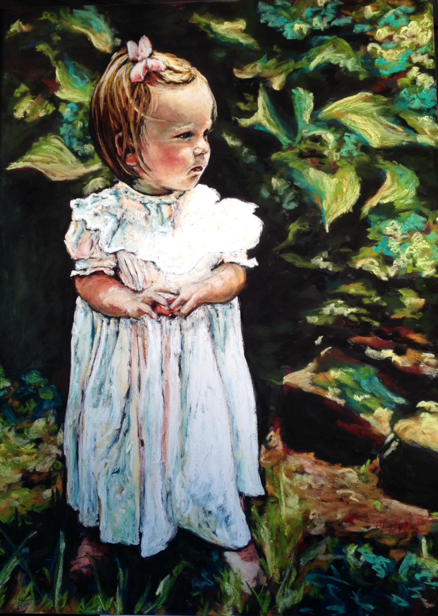
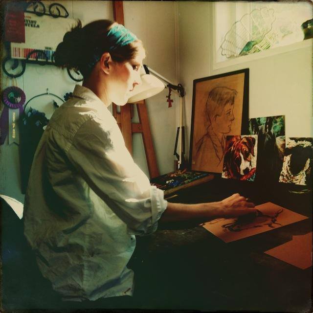
Sometimes you find new inspiration in unexpected places. Bored with the same old style of my art, last Fall I found bold new colors and the freedom to enhance what is seen thanks to a text message joke from my sister. As children, we had this joke (which will probably sound lame, but we thought it a hilarious trick). We took lots of road trips back then and whenever we saw a hay bale, we’d say “Hay, (insert name).” If the chosen trick-victim said “what?” the trickster would giggle and giggle and point at the hay bale, exclaiming “I got you!” I told you…a little lame, an inside joke, but it was funny to us. As adults, let’s just say it may or may not still happen…

Now bringing my ramblings to a point: on the way back from a family beach trip, my sister texted me the picture below with “Hay (omitting funny childhood nickname) Mary Liz!” She had snapped the photo out of the window with the Hipstamatic App on her iPhone.

Hay Bales, 12×16 soft pastel

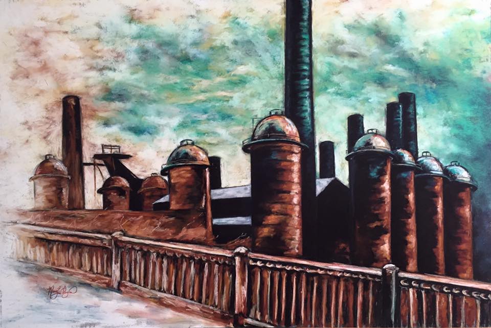
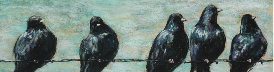
Her little joke set me on a new course full of turquoise and golden skies, darkening edges, simple photos from our region of the world. Since that day, I have taken a whole collection of pictures from rural Alabama and love finding inspiration in alternative colors thanks to Hipstamatic. If you are unfamiliar with this camera app, it is a program you can purchase very inexpensively on smart phones that allows you to change combinations of lens and film to get different colors and effects. My favorites are the John S lens and the Bettie XL lens. I love experimenting with it…you never know when you’ll get something new and fabulous! It is a great asset to my artwork. Below is another example of a different lens/film combination.

Hay Fields

marylizingramart —  March 18, 2011 — 1 Comment


Hay Fields, 12×16 Soft Pastel on Board

I love pastels, and I love teaching. Because of the nature of this dusty medium, it is hard to demonstrate to a large crowd since I cannot easily draw the picture upright, as on an easel, as the pastel dust cascades down the board with each stroke. To remedy this problem, in a recent pastel demonstration for the Birmingham Art Association, I inclined the board a bit to make it more visible and drew upside down, standing behind the table. My unorthodox method worked and here is the finished result: a colorful landscape that began upside down and was touched up a bit at home. I like the bright colors and think it is a pleasant, simple little scene.


These two pastel pieces, “Change of Shoes” 16×20 and “Passing Time” 18×24, have been accepted into the Energen Art Competition…March 14-27 at the Energen Plaza in Birmingham, AL. I am happy to be a part of this prestigious show and looking forward to seeing all the wonderful art!

A New Contrast

marylizingramart —  October 7, 2010 — 1 Comment


These pictures began to take shape on the way home from a family vacation to the Gulf Coast, when my sister sent me a photo via her phone, taken in transit, of hay in a field. I found great interest in the quality of the picture, with dark edges, blurred grass full of movement, a quick and simple snapshot of a familiar rural Alabama scene.

When I began creating the pieces, drawn outside in the newly-cool Fall air, I once again unconsciously intermingled my current state of being into the art. The brightened, more vibrant colors mixed with the darkening edges mirror my mood this week; happy, hopeful and full of rich life, with a bit of darkness lingering in the edges. The intermingling of Joy and Woe revisit my thoughts. I see a great contrast in life…the good and bad, the happy and sad, the rage and peace, the love and hatred, the energy and fatigue.

This new moment in my artistic journey of greater contrast, heavier color and darkened edges was a surprise to me…an unplanned development. The brightness darkening feels a bit ominous, like something is about to happen; like when you walk outside and know a storm is coming, when you can feel the pressure in the air. A heavy moment of stillness, a pause before the event begins.